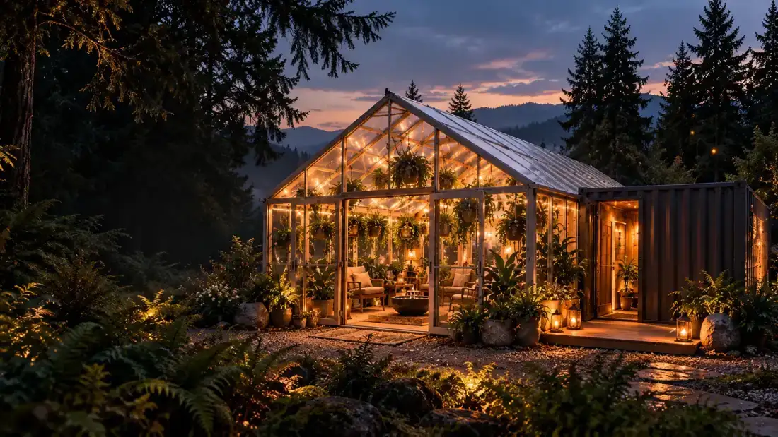
The photograph anchors the idea
The original greenhouse image supplied by Colin shows the existing structure, neighbouring container, trees and plants. It gives the project a recognisable starting point. The enhanced version improves the visual mood with warmer light and clearer detail, but it remains an interpreted image. We keep the original file so that the enhancement does not replace the underlying record.
Concept artwork explores a possibility
The finished greenhouse and private-room boards develop an atmosphere: natural wood, greenery, soft light and a bee-inspired experience. Their job is to help communicate the idea. They should not be presented as photographs of completed rooms or as evidence that the illustrated features have been installed, tested or made available to guests.
Use the same theme, with clear roles
A strong brand can connect real and imagined images through colour and composition while explaining which is which. On Med Bee Tate, the warm amber direction links the homepage hero to the supplied concept boards. Captions identify the artwork and the enhanced photograph so visitors can enjoy the vision without having to guess the project’s status.
What comes after the first look
As the space develops, actual progress photographs and confirmed details can take a larger role. The pages can then describe what exists and how the experience will operate. Right now, this site is a concept preview with no open bookings or product sales. The journal gives us a place to show the thinking behind that transition.